(and they rule by our command, at our command, the West is nothing but Democracy)
Earlier Posts:
Have wanted to write an additional update to my series of posts on the Covid-19 pandemic, the hysteria and misinformation surrounding, and the persisting government lockdowns wreaking havoc in the West, but unfortunately did not have the opportunity to do so or time. The initial idea for the update would have been 2 months ago or so, and would have proven quite far-sighted. But no matter, my articles from 4 and 5 months ago, have been in many cases tragically correct, and I do not shy away from saying that gradually and painfully, concepts that were spelled out in my posts from very early on and at the time being repeated by none that I could tell, have been appearing in the headlines… piecemeal, gradually, reluctantly and painfully but several of the concepts I proposed are now even commonly held opinions. They were not at the time.
In any event, the time I so eagerly covet to write my piece is still not available to me. A reserve duty stint does not allow me to post the fleshed out article at the moment, but rather than posting nothing, I leave you with the bulk of the charts and data that will be in the post. Final editing on the actual text will be done Gd willing, upon my return. At that point I will get to many more things, the silly masks, the absurd and dangerous lockdowns, the hapless government decisions, what further data has told us about this virus, antibodies and government interference with the existing cures and vaccines.
Meanwhile enjoy the charts.
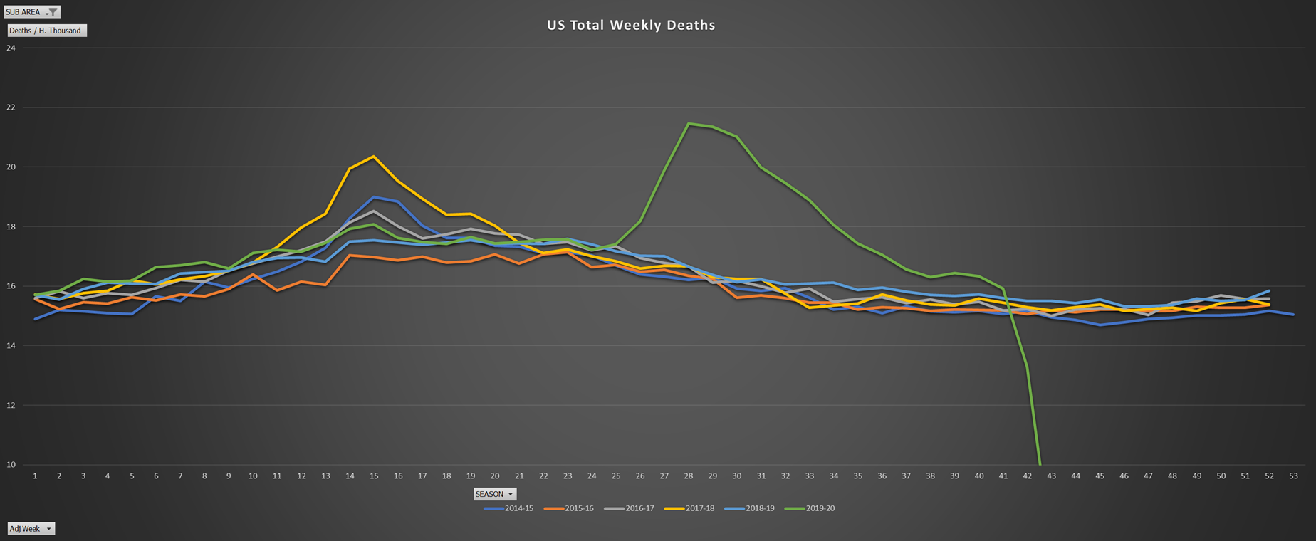
Note the story they tell despite the charts you constantly being shown by the media.
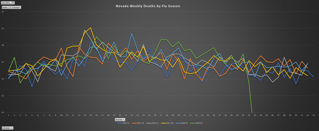
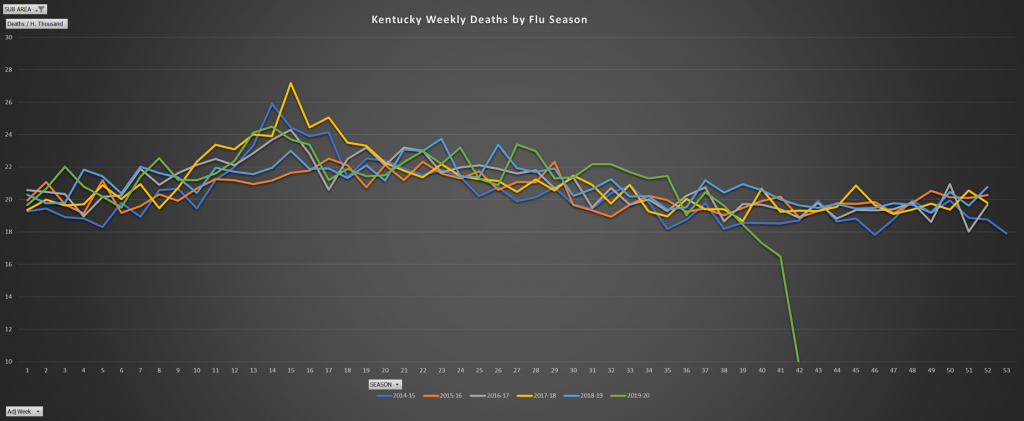
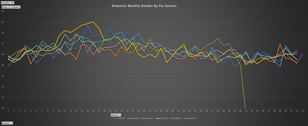
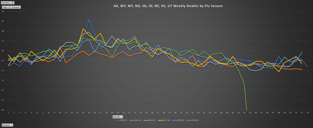
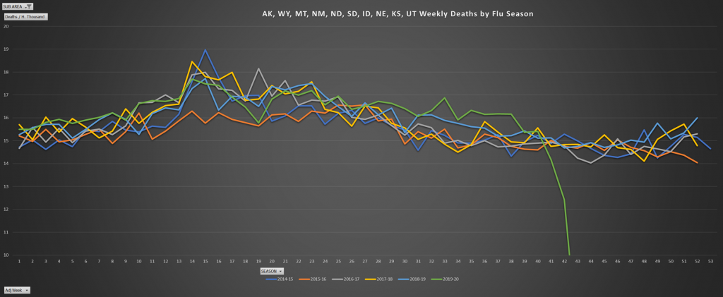
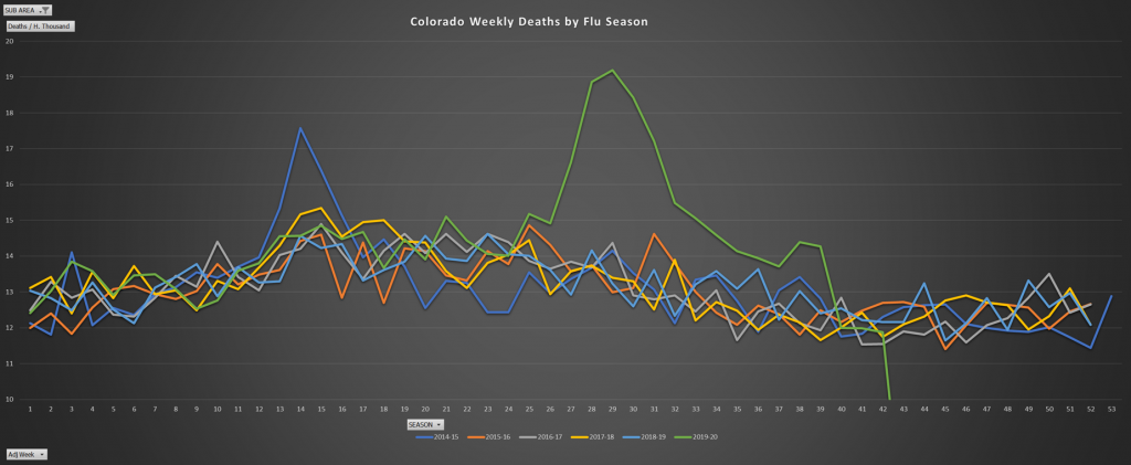
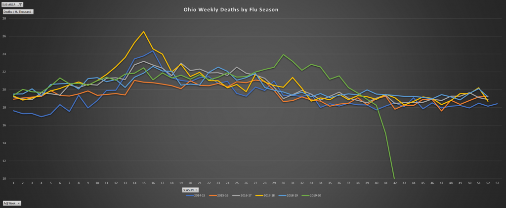
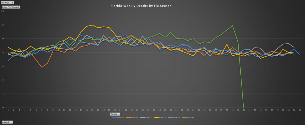
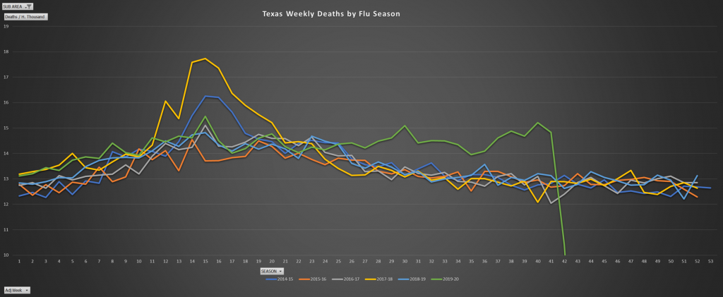
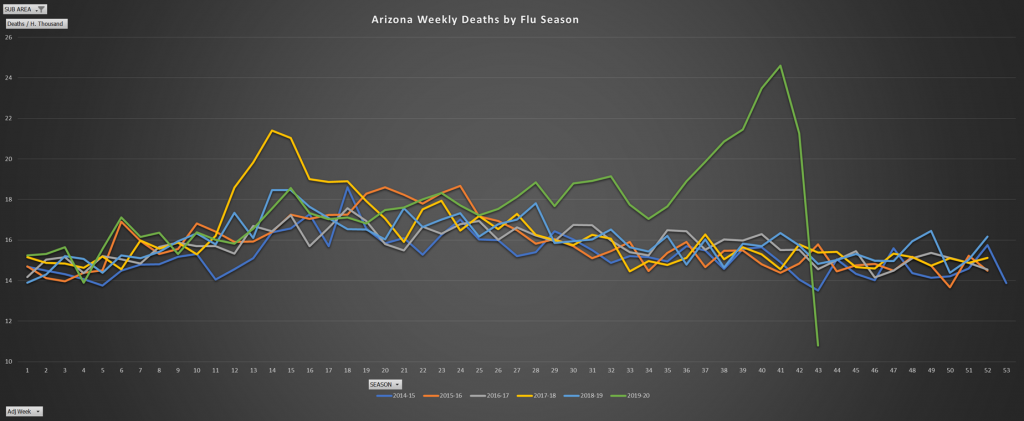
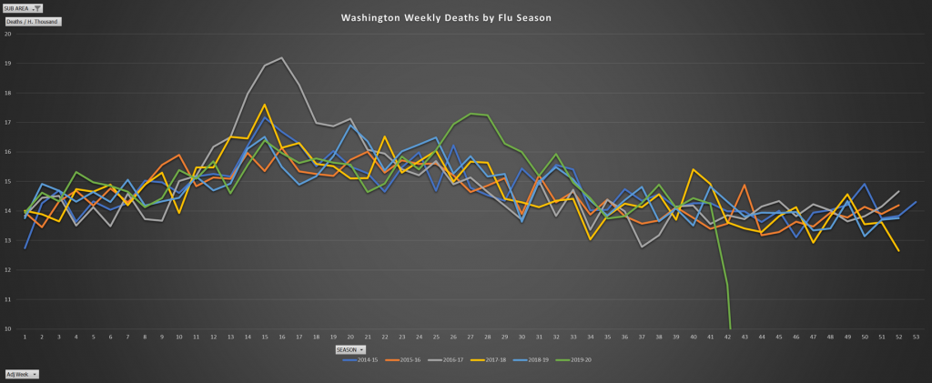
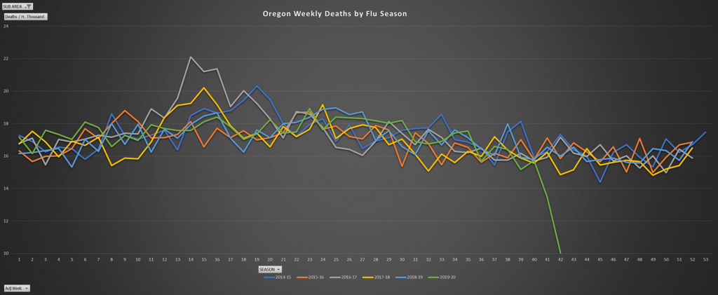
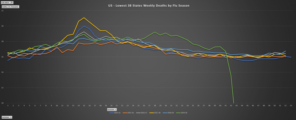
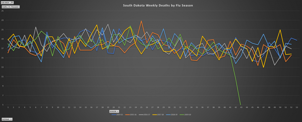
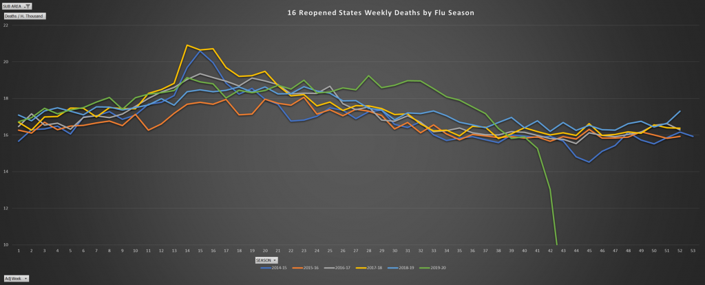
Please note the scale of the charts. Notice that seemingly large peaks mean that the deaths per 100 thousand people went for example, from 15 to 18 people. This is the reason while the flu, while certainly dangerous for the very old and very young each year, is largely ignored. It is not the black plague. And neither is this corona virus that we ha have lost our minds over.
The adjusted week simply means that week 1 is the first week of the flu season rather than the first week of the year. This is done in order to have a continuous pattern in the chart, and to correspond with the CDC tendency to do the same.
Will post the table of the corresponding weeks and dates for those interested in the comparison and pinpointing exact dates.
Note the flu just a couple of years ago, 2017-2018 season, was quite strong. Also keep in mind that this went back just a few years, and obviously the more we went back, the stronger we would find certain flue seasons (and periods of other diseases causing increased mortality). The further back we go, the worse they would look.
Also note the total deaths are per 100k population (at the time). Also note that it’s virtually over.

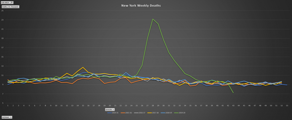
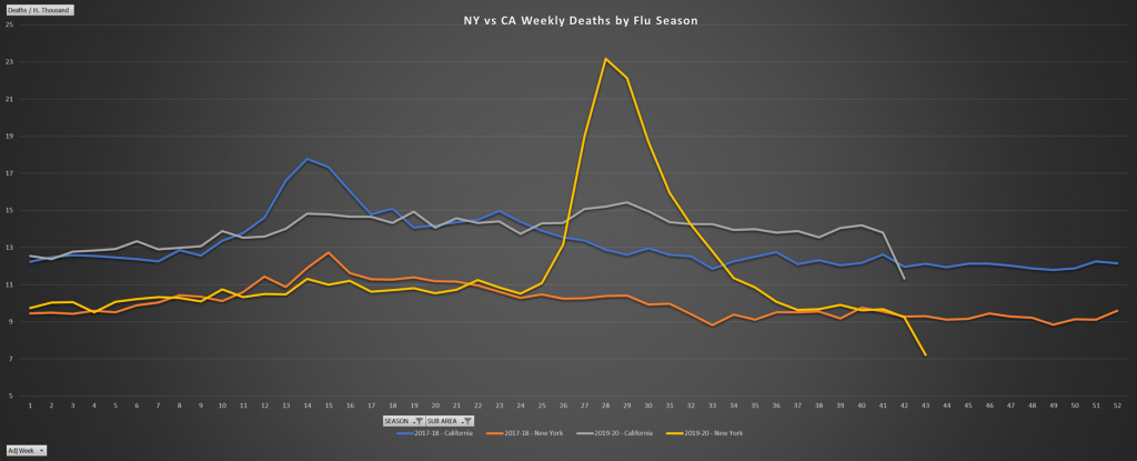
The (highly praised) shame that was New York’s handling of this situation:
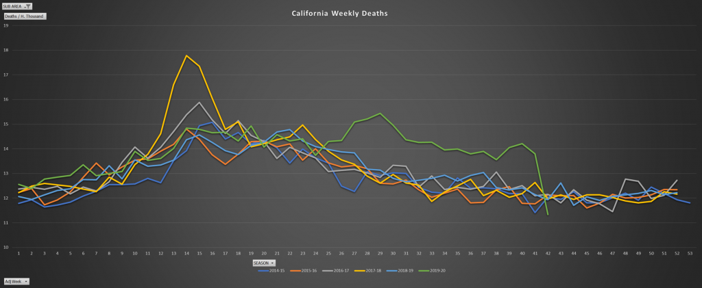
A large state, with a huge population, densely populated, that was not as incompetent in it’s handling. California.
Note peak weekly death rates never top those of two recent flu seasons.
Similarly, the story for the US as a whole MINUS the top 6 States in death rates.
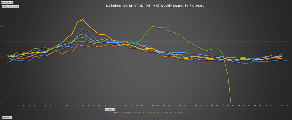
In fact, the US minus NY alone, has a peak death rate nearly the same as the 2017-18 flu.
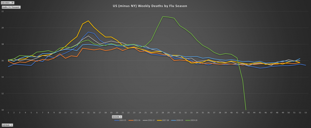
For individual states, interesting stories. Georgia, famously reopening early, and a Governor that fought lockdowns, both those coming from above at the federal level, and those being imposed by local governments. The deaths, similar to a strong flu, never reaching the peak of the 2017-18 season. Also clearly over.
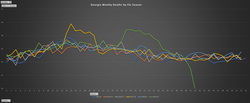
New York of course is not alone in poor handling . Big Democratic cities all did poorly. Another article of mine that hopefully I can get to soon will focus on that… starting at county level. It is difficult to disentangle the variables because they all correlate.. density, percent leftist/Democrat, Democratic mayors and governors, higher degree of socialized health care, racial diversity, and the like. You get more of all of them at the same time in the big cities. So here is Illinois with places like Chicago.
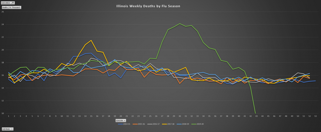
And Pennsylvania in a similar fashion.
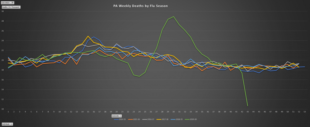
Nevada is very interesting due to Las Vegas of course. The massive scale of its tourism proportionally, unsurprisingly made it show evidence of an earlier infection than New York. However, like in most western states, you can hardly notice the Corona virus effect at all.
Take Kentucky for such an example, where this is even more so. You can also see how the flu seems to be much more contagious, despite what we hear… rampaging savagely and quickly even in low density rural areas with surprising speed (before it either finishes its curve and/or summer famously but still not fully explicably kills it off).
As stated in my previous articles though, the US is a a big place and it is possible certain places, especially rural places are significantly “behind” in the curve. Take a look at Arkansa, nothing approaching some of the recent flu seasons (again despite the rural nature), but a smaller more recent spike, which is already on its way downwards (more on that recent spike in certain southern states later)
Some of these Western and more rural states.
Colorado, something in the middle now.
A relatively dense state, Ohio, in which not much more than a strong flu period has happened. Also, showing evidence that it is clearly over.
The States recently on the news as surging. Florida.
Texas still not approaching the peak levels of recent flu seasons.
Arizona, quite unusually (and therefore more to this story).
Washington State was likely the site of the earliest significant spread in the US (as was discussed in my previous post). They had a heck of a 2016-2017 flu season. Not all that much going on now.
Similar story in next door Oregon. Protests and riots not withstanding. Corona weak sauce.
But remember… you get lots of Democrats handling the health care of minorities, packed relatively densely, and you get some bad results, as in New Orleans.
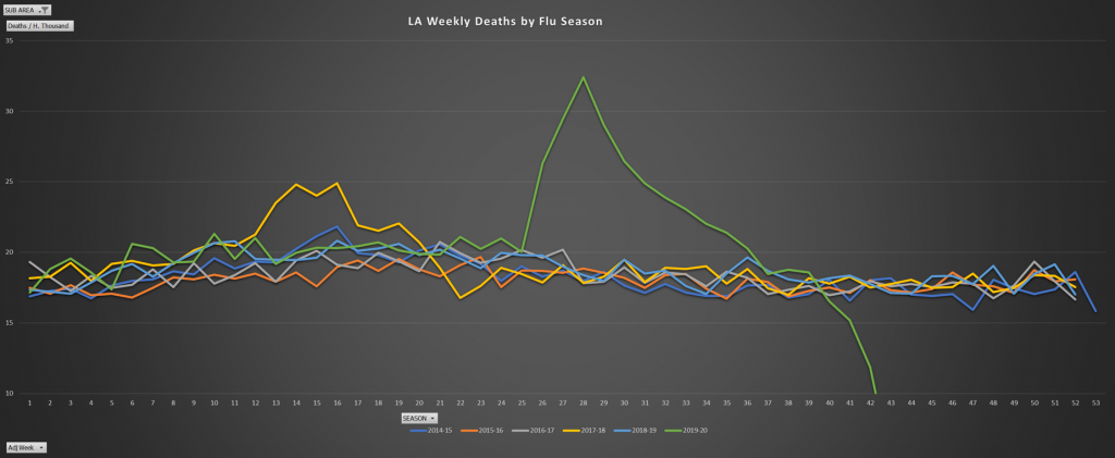
In Summary, the US minus the 5 worse performing states.
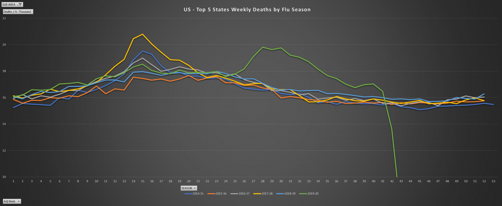
The US Minus the 10 worse.
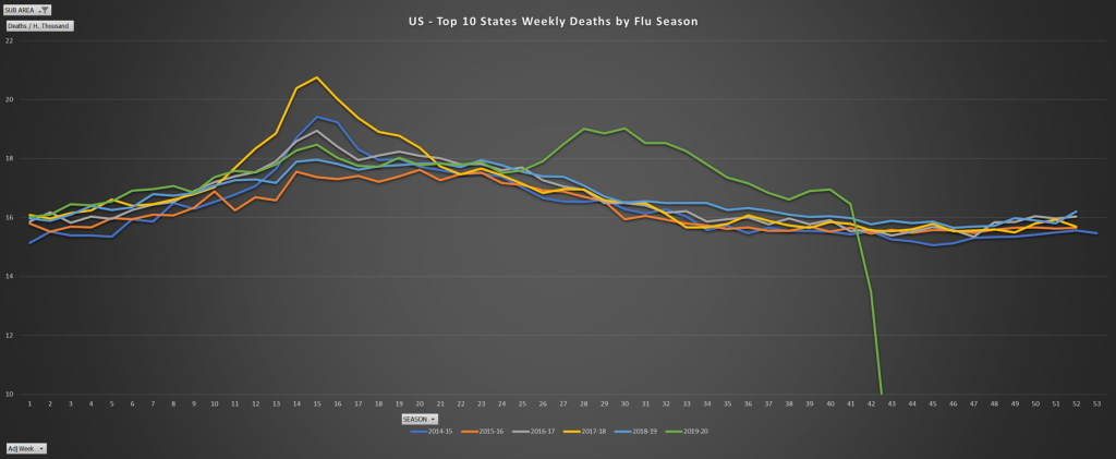
On the other hand, the worse 6 performers.
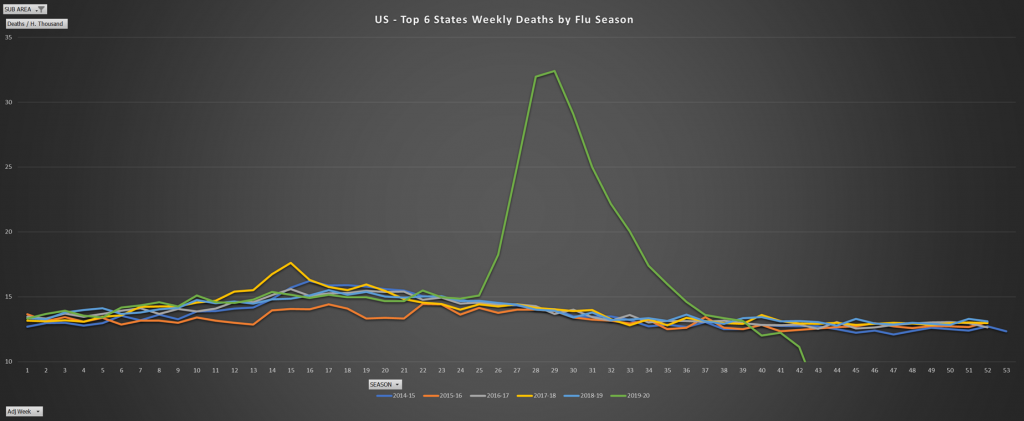
The 25 states with the lowest death rates. Half the states. But very little of the population you say? Nope… over 45% of the population. Not much going on there.
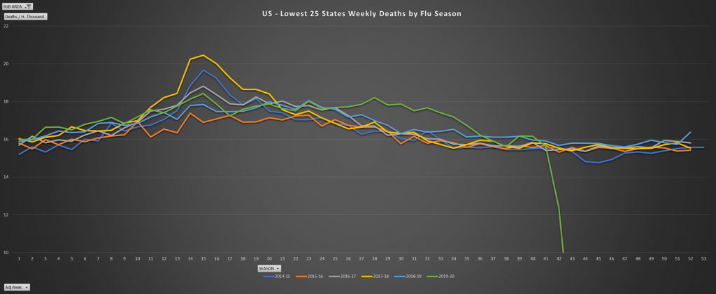
Let’s push that concept further. The lowest 38 states (lowest in covid death rates). Over 75% of the USA population resides in one of these states. Peak rates don’t approach a strong flu season. And we see it has largely ended.
A New York vs California comparison. Notice the lie about a late California infection vs New York as discussed in my earlier posts.
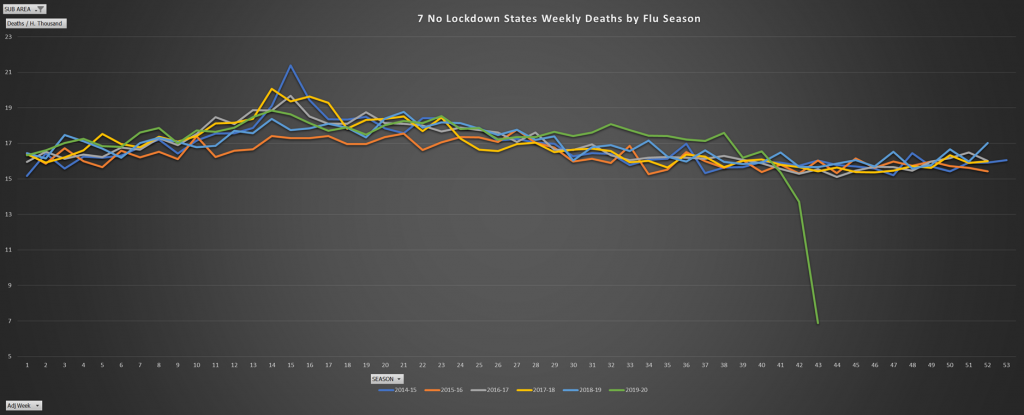
The 7 Never Lockdown States (nearly true).
South Dakota, which really never locked down.
The 16 reopened Sates.
Some fascinating international data to post. Unfortunately no time for now. Stay tuned for more, including much more international, including my favorite example, Sweden. (this is a bit older data, will also update shortly with newer weekly data).
Germany
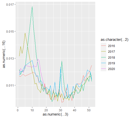
AUT
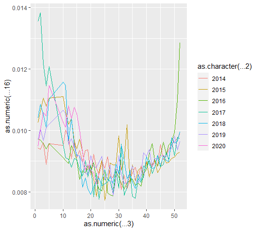
Sweden
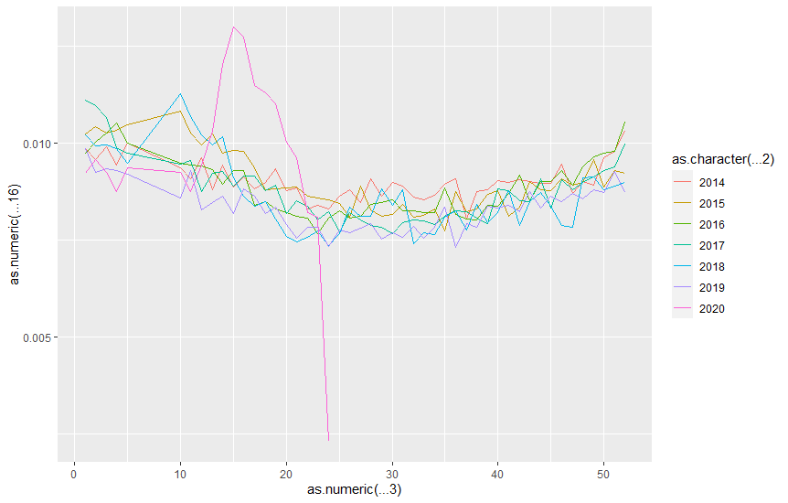
Italy
Spain


Facebook Comments
WordPress Comments
Disqus Comments